Hearing the word 'landscape' makes me think of nature or it's the description of the moment that you're currently seeing. Landscapes is an art form of photography where the main focus is mainly the background.
Things that associate with landscape:
Things that associate with landscape:
- Sunsets
- Nature
- Cityscapes
- Current moment
- Skys
- Weather
- Saturation
- Views


Searching up 'landscapes' on google, it gives us a variety of pictures. Most are of the sun shining from behind the mountains and trees, however you do come across strange or unusual images. For example, the second image. What's unusual about this image is how empty the area is and the saturation between the blue and orange, as they are opposite each other on the colour wheel.
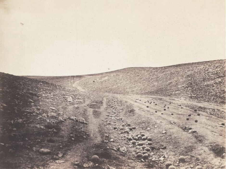
Roger Fenton - The Valley of The Shadow of Death, 1855 |
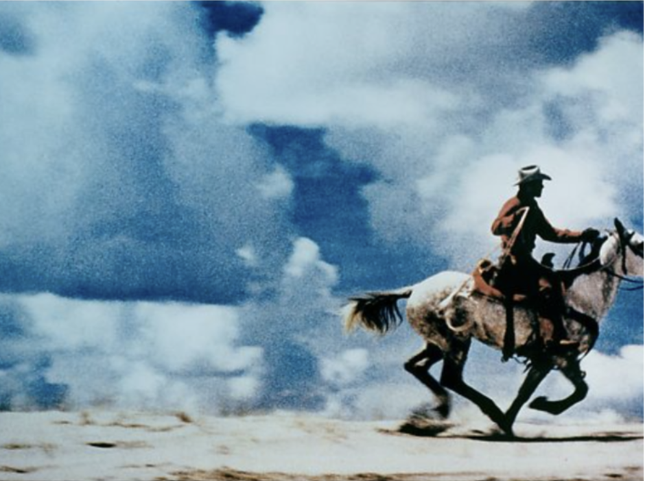
Richard Prince - Untitled (Cowboy) 1989 |
|
Observing this image, it seems that it was taken possibly after a war has happened. I can tell by the left over cannon balls that are laying on the dirt road. This is famously one of the photos Fenton has taken from a large collection during his time in the Crimean War. Fenton takes this type of photos to bring war into life through photography. Throughout his collection, each photo depicts camp life, soldiers and the aftermath of battling. This particular image is the only one that has a 'second' version to it. This caused a big argument to whether this image was staged and which one was actually 'first'.
|
In this image, the main focus is the horse, of course. However, Richard has used a technique to make his images 'blurred' or making it look like it's in a distorted motion. For example, the horse is very clear to see, but as we look at the background it looks blurred or seems like its moving is fast motion. This enhances the effect of the horse galloping. Another thing to point out is the colour. The cowboy has a brownish - red silhouette, where the sky is blue. Even though they are not opposite each other on the colour wheel, they still contrast each other.
|
The main differences between the two is that one has colour and the other doesn't, Richard's has a subject, being the horse but in Fenton's image theres no-one to be seen.
Tanjan Deman


Deman's work all share a similarity, where she puts her work into greyscale and her work is all something to do with landscapes. In my opinion, the way she portrays her work is very surreal to me. For example, the first two images. It's something that you don't see on a daily. Going to a theatre, normally there isn't a huge image of trees but in this case there is. And to add to that, the second image shows a hill of earth in a stadium with lights shining against it. All of her work has a blast of nature, which is what makes her landscapes to successful.
Photograms


This is what we use to make negative photograms. To make a photogram, you must use an enlarger. Put your original photo on top of a photographic paper and putting it under the enlarger, exposing it for a minimum 30 seconds. The enlarger produces light which acts like a printer, mimicking the original photo on the photographic paper. We now need to put it into chemicals. This includes the developer, stop and fix. The developer is used to develop your photo turning it into a photogram. Secondly is the stop, this stops any further development . Finally, is the fixative mix. The fixative is used to remove any unexposed bits of the photogram.


Here you have the original photo, the acetate and then the negative photogram. As you can see, the negative photogram came out blurry, this is because under the enlarger there is the acetate on top of the photogram paper. When the enlarger is turned on, the acetate must’ve moved creating a distorted effect.
Out of Focus
Bill Armstrong
Bill Armstrong is a photographer who's work is based around fine New York art, and is very well known for his blurred colourful photographs. This technique highlights a somewhat like shadow figure in the image or background.


Uta Barth
Barth is a German - American photographer whose work addresses themes such as perception and optical illusions. She explores and play around with lights and see how it can be used differently to create different effects. In her works, she mostly uses the technique of blurry visuals, where she manipulates the focus of the camera to be blurred.


20 Out of Focus Photographs


Dionne Lee Constructed Landscape
Drafts from Dionne Lee on Vimeo.
In this short film, many examples of 'constructed' landscape. Two in particular is the different variations of space and nature (icebergs and lakes). They gather different landscape images from National Geographical sources and vintage magazines, rearranging them together by ripping, folding and cutting them up to create a collage. What I like about it is that the actions and images are very random, this is what makes a draft a draft; because the page is doubled, you'd never know what is on the other side. It's similar to traditional landscape images because it's still using skills to combine the images together. In my opinion I think that the artist do feel a bit awkward and confused at first, because this is their first attempt on making a collage and seeing which photos go together. But I think the artist's overall feeling to landscape photography is neutral.
Minimal Landscapes


This work was inspired by Liz Nielsen's art where we take parts of an image away to 'simplify' the image.
South London Gallery


This trip was to the South London Gallery which is all about Nigerian and British-Nigerian artists who explores links between Lagos and Peckham as it travels through issues of migration.
"This gallery has a rigorous international programme, but still feels very local. It's very much about the area and the people who live around it." - Ryan Gander, artist.
I chose this quote because, in my opinion it holds a lot power. He describes the South London Gallery and talks about how small yet close the community is. He also states that the people and area is what actually makes up the 'art' of the community.
Peckham Photowalk


Dafna Talmor Research
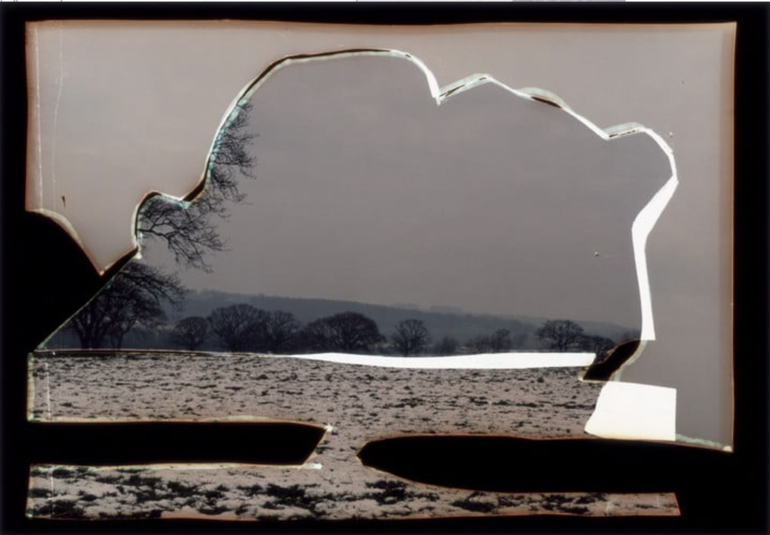
Dafna Talmor is a London based visual artist who's main focus is on Constructed Landscapes, spatial intervention and collaborations.
|
In this landscape, I can notice a few unusual things. For example, the distortion of the cut out and the main image. As you can see, it has been cut in a way that leaves out black and white spaces. Another thing that I can see is the edges of the image are discoloured; they look like they’ve been burnt. Dafna Talmor was able to make this image by using 2 negatives and putting them into a collage. Because this image is a negative, Talmor most likely went through the process of making on; by using an enlarger, photographic paper and the three chemicals, developer, stop and fix. To create the irregular shapes, she might've use scissors and the technique of overlapping to create the rough edges, then lit them on fire for that slight burn colour. The colours also look somewhat mutated, with the mixture of grey, white and black reflects an eerie theme.
|
Sarah Anne Johnson - Research


Sarah Anne is one of my inspirations for doing my project, mainly because she focuses on the theme 'Nature' which is also going to be one of my themes. Her work is filled with trees with vibrant colours, scattered around. The colours look random but how they are composed, it looks like it's in harmony, which I like. Words that I would use to describe this series of photos is exciting, cartoon-ish, colourful and unique. The reason why I chose Sarah was because of how fun her works look. In the first image, the sun is shining through the trees with triangular colourful shapes surrounding it, which reminds me of an explosion. But in this case, it's like an explosion of colour. The second image reminds me of a kite, with the large coloured in spaces between the trees, connecting tree branches together like it's a dot-to-dot puzzle. It makes the image feel complete. Lastly, the third image of different to the first two. Here, it looks like she has drawn blobs or spots on top of the original image. The spots give the image somewhat of an infected look, yet it also adds to the image, making it also feel complete. I think that this is a mixture of both naturalistic and abstract.
Space in this series is very minimal, as the colours fill in those spaces. If you were to put the Rule of Thirds over it, you'll see that most space is taken up by plants, and shapes. Another way space is taken up is how the way the camera is posed. The first two, it seems like the camera is looking up at the trees, minimising any space. Whereas the third image, the camera is placed more to the side, with the tree in the middle. She specifically chose a tree that has long branches and is surrounded by other plants.
Space in this series is very minimal, as the colours fill in those spaces. If you were to put the Rule of Thirds over it, you'll see that most space is taken up by plants, and shapes. Another way space is taken up is how the way the camera is posed. The first two, it seems like the camera is looking up at the trees, minimising any space. Whereas the third image, the camera is placed more to the side, with the tree in the middle. She specifically chose a tree that has long branches and is surrounded by other plants.
Vlatka Horvat - Research


Vlatka Horvat is my second inspiration as they focus on local area/cities. I like their work because of how unusual and satisfying it is. Their work is made up of images that has something taken or cut out of, another image being added on top of the original, or a change in composition of the subject. I think I can easily accomplish this by taking a simple image of an area and manipulate it into being distorted or by using photoshop to add or take away things. Analysing this short series of images, I would describe them as strange and unusual. This is because of the added photos, uneven proportions and positive spaces that the images beholds.
In the first image, Horvat combined two images together, creating an interesting effect. They had covered the peak of the dome with an image of a volcano; personally I think that it makes it unusual because of the pink smoke coming out which is unnatural. Here, I can tell that they had used the Rule of Thirds to compose the camera. The pink smoke also leads our eyes to the tree behind it, which unknowingly completes the smoke puff. The second image shows a building that has different lengths of floors that also has been misplaced. Another thing is that the road beneath is curved inwards, which distorts the image even more. It's interesting because the length of the floors also corresponds with the length of the brown, brick wall. The last picture can possibly went through the process of both Photoshop and physically experimenting with the image; As you can see, there are bits that has been cut out and placed in the background, disguising it with the actual buildings.
In the first image, Horvat combined two images together, creating an interesting effect. They had covered the peak of the dome with an image of a volcano; personally I think that it makes it unusual because of the pink smoke coming out which is unnatural. Here, I can tell that they had used the Rule of Thirds to compose the camera. The pink smoke also leads our eyes to the tree behind it, which unknowingly completes the smoke puff. The second image shows a building that has different lengths of floors that also has been misplaced. Another thing is that the road beneath is curved inwards, which distorts the image even more. It's interesting because the length of the floors also corresponds with the length of the brown, brick wall. The last picture can possibly went through the process of both Photoshop and physically experimenting with the image; As you can see, there are bits that has been cut out and placed in the background, disguising it with the actual buildings.
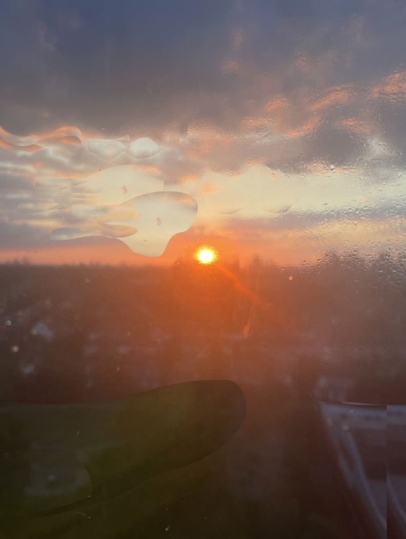
My response to Sarah Anne Johnson's work


In this image, I have taken the influence of Sarah Anne Johnson and played around with shapes, and how they can change an image. I have used Photoshop to create unique clear 'blobs', making the sky misshaped. Due to the fact that my first response did not have much correlation to Sarah’s work, I have gone to the Photos app and used the brushes to add colourful colours.
|

|


The Mock


Triptychs and Diptychs
-what they are and why I used them-


Triptychs and diptychs are a form of a short series of photos. Triptychs are three-part series, whereas diptychs are two-part series. They are commonly used in photography to tell or represent a story, acting like a timeline via using pictures with similarities.
