5 Elements of a Portrait
- Composition
- Framing
- Subject
- Lighting
- Still-ness
- Framing
- Subject
- Lighting
- Still-ness
|
The first time i've seen a portrait photograph was a printed photo of me and my parents. In the picture, there was me and both of my parents at a party venue, this was most likely my first full moon party (a party that celebrates the newborn's first month of life). Yes, this photo was printed . Once the photo was printed, it was kept in a photo album. Words that describe the photo is wholesome, special, memorable and happy. Throughout my life, photography has advanced a lot. Images now are more focussed.
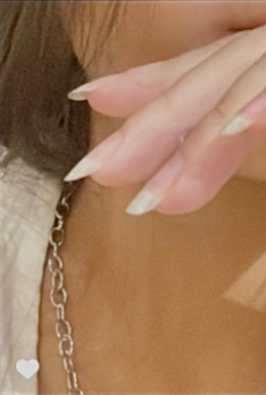
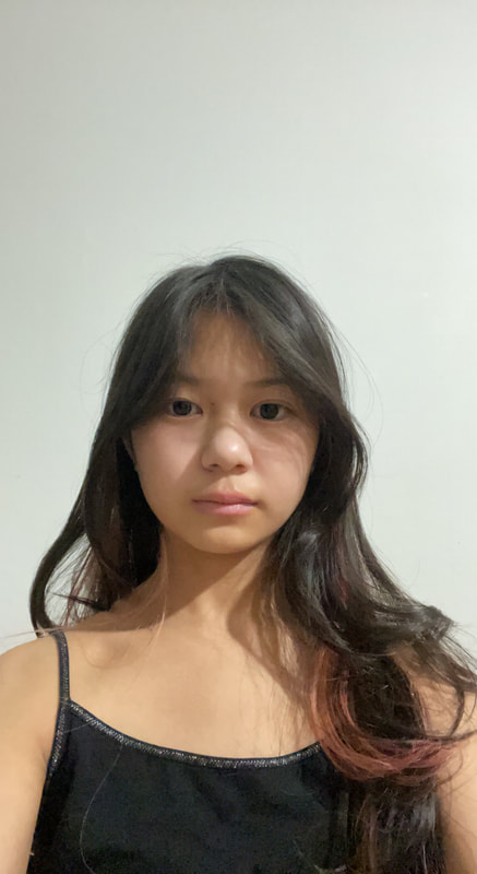
This is one of my favourite pictures because of how my hand is positioned and how i am in frame. This picture is very neutral and normal, not much is going on but it still looks nice. The lighting contrasts with my features. |
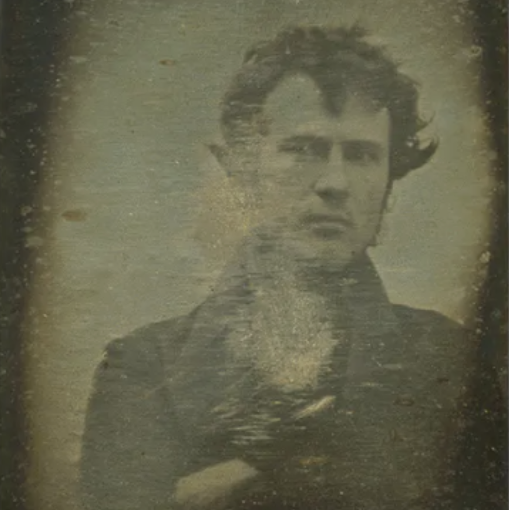
Robert Cornelius - Self Portrait , 1839 |
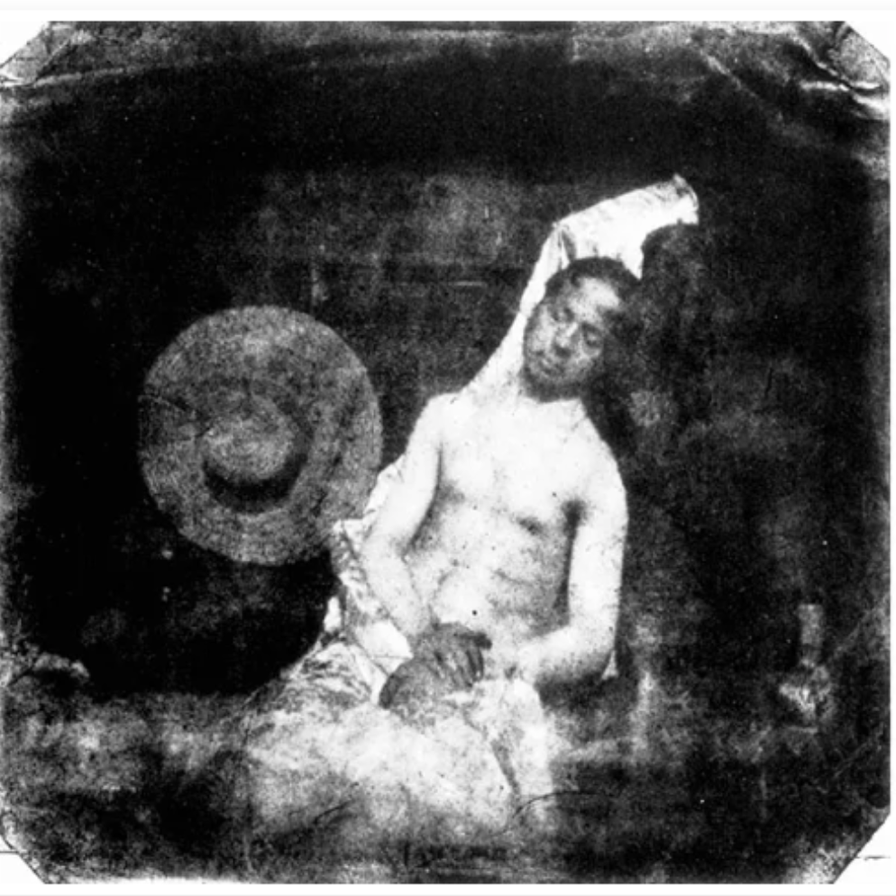
Hippolyte Bayard - Self Portrait as a Drowned Man , 1840 |
The similarities between these two images is that they both have a person in the middle. However, the difference is the year they were taken and how they are positioned in the photo. Robert's photo is his face and upper body just looking at the camera, whereas Bayard's photo is him positioning himself as a drowned man with his eyes closed and looking dead. These images are self portraits. Robert's framing is more closer and more to the right; Bayard's framing is more further away from the camera and leaning to the side. The background in these images aren't very clear so you would have to use your imagination. Robert's photo is just with his shoulders and face is because he had placed the camera at the back of his family's shop and removed the camera lens then ran into the frame, creating a somewhat distorted image. Bayard is positioned with him leaned back, eyes closed and hands on top of each other is because he is trying to imitate the 'drowned man' look.


In todays lesson, we started with a simple and quick task of taking self portraits following the requirements of : Reflection, Obstructed, Layered, Rule of Thirds, and Symmetry. The first one corresponds to 'reflections'. Second, ties up with 'obstructed'. Third, links to symmetry and the last one kind of link to 'rule of third' or 'layered'.
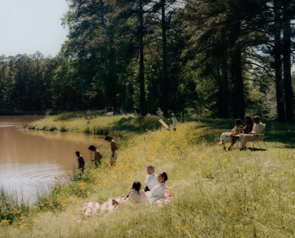
Family Portrait & Recreation
|

|
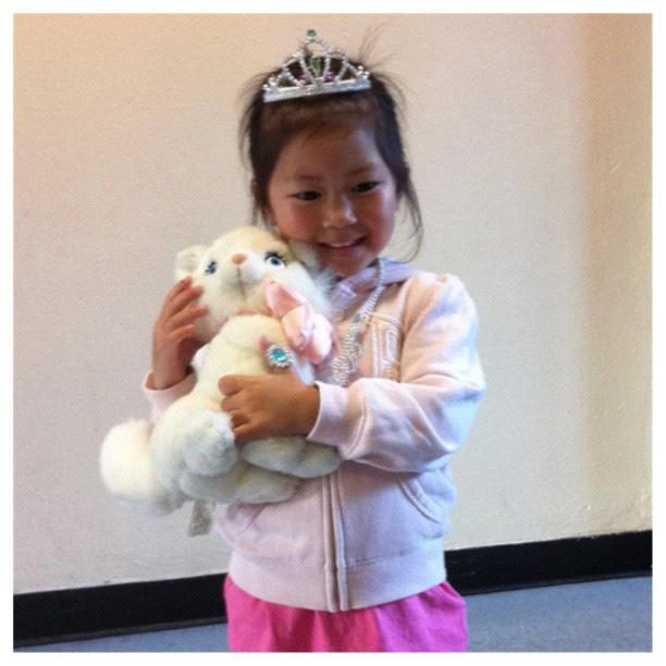
This is me attempting to recreate one of my old pictures from when i was younger. Of course not everything will be the same, such as the background and specific items; however, i think that it wasn't too far off. The pose is mostly the same and the clothes are basically the same concept. However, i do think that i can do better with the background and angle. The re-creation photo isn't showing much of my face like the old photo.
The Relationship between Portraits in art and Photography

-Johannes Vermeer, 1657-1659 |

-Taken by Tom Hunter |
Looking at these two photos, you can almost identify some similarities. The similarities is the composition of the ladies, the angle the picture was taken, and where the lighting is coming from. They both also have similar facial expressions and body language. However the difference is the time era these two was taken in. Vermeer's picture is a painting whereas Hunter's one is a photo. The background on the right is more dark and dim but the vibrant red and green colours and white light makes it brighter than it seems. I think Tom Hunter is influenced by Johanna's work is because it uses minimal effort but because he uses easy techniques it makes the image more effective. The visual elements that is used is framing, lighting, the shape, the different texture from the right picture to the left and the colours. I have noticed that the colour scheme is different.The left one has more of a warm colour palette whereas the one on the right the colour is more contrasting and has a vibrancy to it.
Tyler Mitchell Exhibition
'Collectively, these moment become figments of an imaginative physic state of being, one in which radiance, resistance, restraint, comfort, and full human agency exist.' -Tyler Mitchell
Tyler Mitchell is a young photographer who's work is shown in the Gagosian Gallery . His work is inspired my the famous rapper, Tyler the Creator. Mitchell presents his images of black women and men in beautiful states of leisure, safe and encumbered environment. His main focuses is on black beauty, desire and belonging; He uses both natural and artificial forms of nature for his backgrounds which symbolises transformation and possibilities.
-Dreaming In Real Time |

-AnOther Magazine SS19 |
-In My Pink Solo - Dazed |
After observing Tyler's work, i have picked these three images as my favourite.
Dreaming In Real Time - I have picked this image as my favourite because of the dreamy scene and how the colours really contrast with each other. It doesn't use such vibrant colours, like neon colours, but instead it's more toned down and calm. It gives off a very relaxed, happy environment; it has a perfect equilibrium.
AnOther Magazine SS19 - I really like how Tyler used a crown to compliment the person's looks. The lighting gives her that extra detail of making her look even more royal, along with the crown. Her facial expression is very fitting with how she is looking and standing. It really illuminates the her features making her look so elegant.
In My Pink Solo - Dazed - Lastly, this image. I really like how juxtaposition and symmetry is used here. The colours contrast with each other so well but at the same time it also contrasts against each other. The different textures he's used with the clothing and background.
Tyler Mitchell Gallery Trip


These pictures were taken during our Tyler Mitchell's trip. Not only we went to the Tyler Mitchell Exhibition but we also visited the 'The Photographer's Gallery' and dived deeper at portraits, one of them including Chris Killip.
My Main Focus - My Green Adventure


On the trip, we were given a task to take pictures that corresponds with our desired themes. My focus was on nature and the colour green that is all around London.
Chris Killip Inspired Photos


"His stark but sympathetic observation focussed attention on issues and communities often neglected or hidden." - BBC News
Today's task was to go out and take pictures that are inspired by Chris Killip. He took photos in black and white. For his backgrounds, he focussed on communities and industries that have been standing for long enough to see their loss. He describes his picture as 'had a history done to them' which states that he's grown close with his home area and has seen the changes that it has gone through. Killip documents the lives of people who has been heavily affected by economic shifts in North of England, throughout the 1970s and 80s. His art is published in the 'The Photographer's Gallery'.
Today's task was to go out and take pictures that are inspired by Chris Killip. He took photos in black and white. For his backgrounds, he focussed on communities and industries that have been standing for long enough to see their loss. He describes his picture as 'had a history done to them' which states that he's grown close with his home area and has seen the changes that it has gone through. Killip documents the lives of people who has been heavily affected by economic shifts in North of England, throughout the 1970s and 80s. His art is published in the 'The Photographer's Gallery'.

Samuel Fosso, The Walther Collection, and JM Patras, ParisHere, Samuel uses a variety of patterns and colours. His performance focuses on expressing African identity in the mid-1970s.
|

Samuel Fosso, The Chief : He Who Sold Africa To The ColonistsThis particular photo tells a story. Samuel uses his body and features to symbolise the theme 'Selling Africa' . It brings out the visual structure and consumption of Africa and its historical background. He uses bright, vibrant fabric for the background with contrasts with his skin and what he is wearing. It's described as 'contemporary African art' . He pushes his boundaries and presents himself as being more broad and pushes the western perceptions to reclaim the subjectives from expectation of the Western gaze. Fosso projects himself as 'investigating the legacy of colonialism and globalisation through themes of memory and family' .
|

Zanele Muholi, Vumani II, 2019 |

Bester VII, Newington Green, London, 2017 |
|
Zanele explores the idea of Black queer identity in contemporary of South Africa. They take portraits of women in South Africa and accepted the challenge of that homosexuality is 'un-African'. They also explore the themes of racism, sexuality, and politics. They were inspired by local South Africans black queer communities. They used the colours back and white which contrasts with each other. Their white eyes and lighter toned lips fits their dark skin. Zanele uses feathers as a headdress and has a circle of feathers outlining them which creates a halo-like shape behind them.
|
In this photo, they surrounds themselves with large, black headdress but still exposing a small area of their chest. Their gaze towards the camera is neutral with their body slightly tilted to our left. The white background, eyes and lips makes the black pop out and contrasts with one another for being opposite colours.
|
" I'm reclaiming my blackness, which I feel is continuously performed by the privileged other. My reality is that I do not mimic being black; it is my skin , and the experience of being black is deeply entrenched in me. Just like our ancestors , we live as black people 365 days a year, and we should speak without fear." -Zanele Muholi
Breaking Boundaries

Viviane Sassen 'Cluster' 2013 |

Vivian Maier New York 1953 |
1. One similarity between these pictures is that there is some sort of shadow covering their face. Another similarity is the background colour, they both use the same shade of grey and black. A difference between the two pictures is the time era and location. In Maier's photo, you can tell that it was taken in a much older time period hence the colouration. Whereas in Sassen's photo, it looks like it's been recently taken because of the use of the vibrant green.
2. I think the main difference between the two is the time difference.
3. The formal elements that are shown in the photographs are 'Rules of Third' and composition.
4. Light and shadow has been used to give the images more life and bring more elements to it. It also creates a bigger perspective.
2. I think the main difference between the two is the time difference.
3. The formal elements that are shown in the photographs are 'Rules of Third' and composition.
4. Light and shadow has been used to give the images more life and bring more elements to it. It also creates a bigger perspective.
What is a Genre?
A genre is a group or theme of photography. Within photography, genre is where an expectation is created and builds a meaning or symbolises the 'type' of photograph it is. Different photographers have different interpretations towards the genres.
The Four Elements of a Portrait
- Face (facial expressions, hair)
- Pose or Stance - manner, attitude
- Clothing - sex, social class, fashion and cultural values
- Location (background)
- Pose or Stance - manner, attitude
- Clothing - sex, social class, fashion and cultural values
- Location (background)


In today's task, we were asked to create a series of photos that corresponds with the sub-genres. The themes were police mugshots, family snapshots, self portraits and identification.
1. This photo was to be a happy family snapshot. Here, they are not looking directly at the camera but they are looking at each other with happy and positive facial expressions. I think because of this, it builds a wholesome atmosphere. The sub-genre of family snapshots doesn't really require a certain pose unless it's something for more formal purposes, for example a family shoot. Other than that, the pose can be as free as it wants to be. The photo mimics a family getting ready for Christmas.
2. In this photo, the camera is at an angle so you can't really see their faces but it's still visible, however I think that the angle should've been in front of them. This photo resembles a football team before a game. In my opinion, I don't think that this photo is very effective because it doesn't consists of much photographic elements; if I were to re-take this photo I would have them in height order, change the camera angle and use a different background, trying to include some of the elements.
3. This image is someone who is mimicking the depressing feeling of being trapped behind bars and was supposed to go under the sub-genre of a police mugshot. I think that this photo can hold many different meanings. Although their hair is in the way of their face, it illuminates the feeling of being miserable and guilt; it makes us feel sorrow for the person.
Recreating Arts in Photography
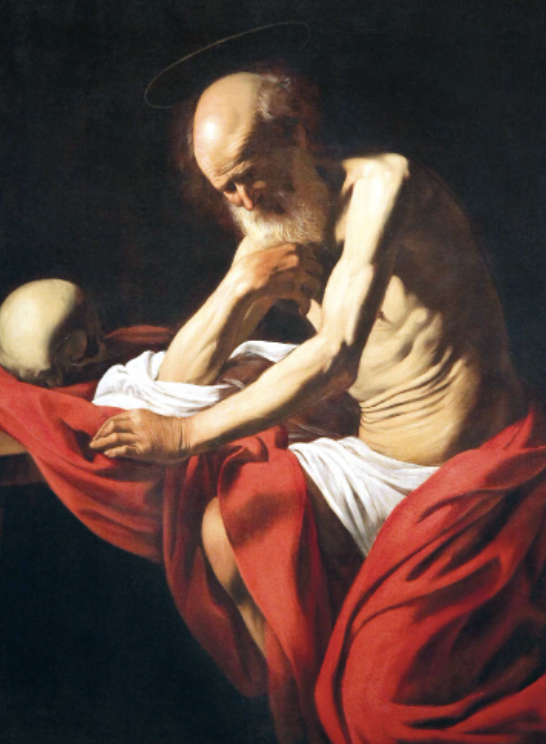
Saint Jerome in Meditation, by Caravaggio, 1605 |

Our Recreation, 5/12/22 |
Today's task was to recreate a photo and to include visual elements. We were heavily inspired by this painting by Caravaggio. In our retake, there was a lot of similarities but some differences, such as the background. In the original, the background is black whereas in our photo, it's white. Another difference is the composition of the subject. For example, the ruffles in the red fabric. I think that the next time I retake this image I will make sure that the subject is sitting on something and the fabric to be more ruffled and scrunched up. However, a similarity in the composition is the pose. Although you can't see the leg peeking out like in Caravaggio's work, the arm and face is almost identical. The lighting could've been shown much more if we positioned it better. To improve this, I would change the lighting to be on the left side and preferably using more than one light.
Recreating using studio lights

Johannes Vermeer: Girl with a Pearl Earring |
|


Todays task was to recreate a portrait by using studio lights. We used a layer of diffusion to soften the light and not creating a harsh shadow. The camera position was from the shoulder and up and the key light was shining from the front-left. We attempted to match our eye level with the original portrait and tilting our faces.. The orientation of how the image is taken was portrait which meant that we didn't need to worry about the foreground.
Alternative Portraits
|
Rhiannon Adam
This artwork is called 'People I've Met' where Rhiannon has a series of portraits of new people who she have met.
|
|
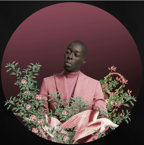
Omar Victor Diop
Omar Victor is a photographer who ,is in this image, is centred in a pink orb surrounded by pink nature. He finds himself mixing a combination of photography with all other art forms which he says 'brings his inspirations to life' . In his art, he doesn't have a natural background, so instead of that, he puts himself in a solid, black background.
|
|
Our Response


In today's task we were asked to capture portraits that respond to one of the few artists on the Thomas Tallis GCSE Photography website. We chose to focus on the photographer Rhiannon Adams. Our third photo is heavily inspired on one of her works, where the subject’s face is seen in a reflection.
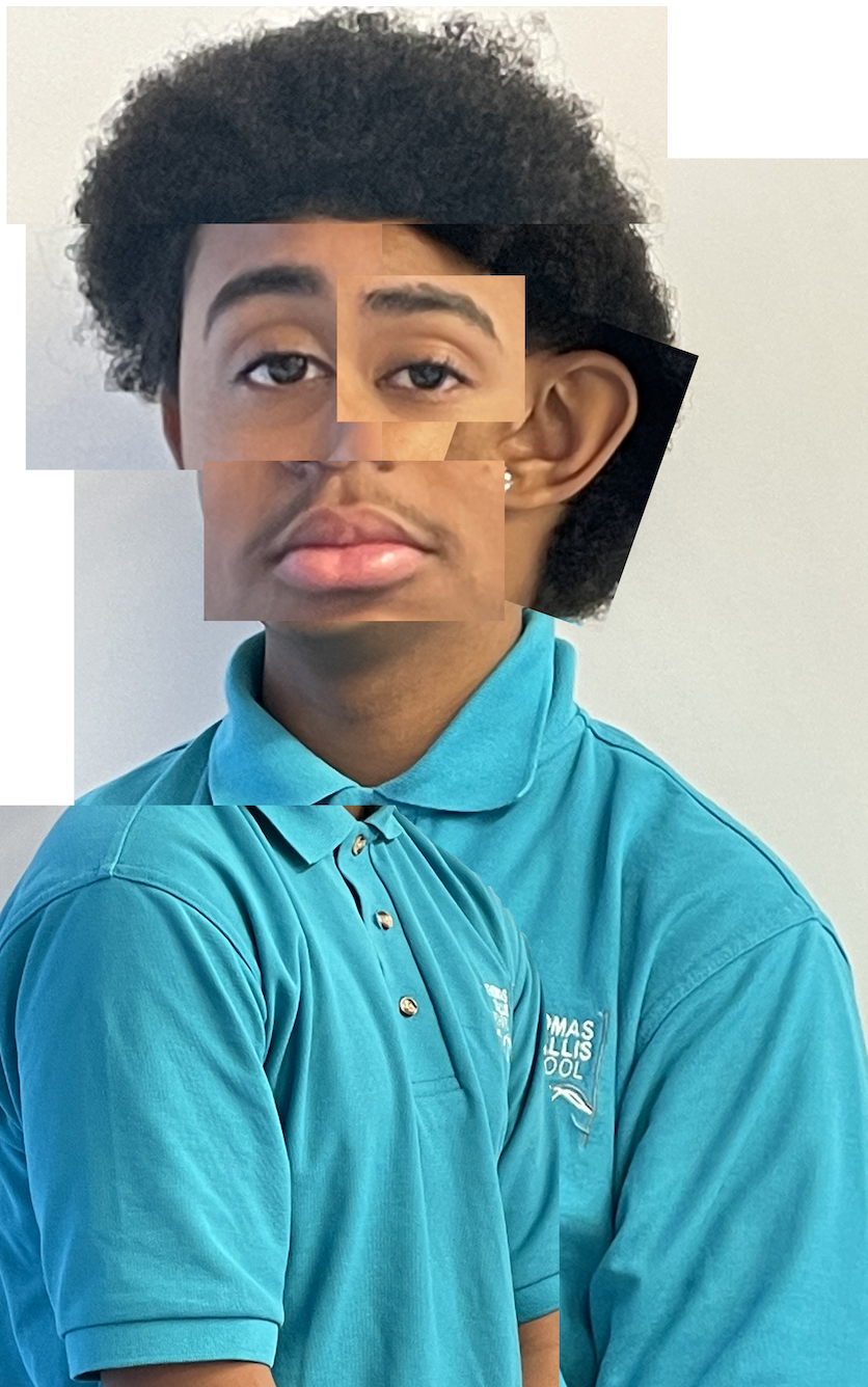
Manipulating and editing images
|
|
In today's task, we were asked to edit our images using Photoshop. We used all different types of editing skills to further develop our portraiture. We started off by adding a new layer to the original image and changing its colour. Because the colour was opaque, we adjusted the opacity of the layer to create a colourful hue. We also turned our images into black and white and added colour to it.
|


The Process - Screen Grabs
|
|
|
Continuing manipulating self portraits
|
|


Photo Joiners
David Hockney Research
David is an English painter, printmaker, stage designer and photographer. His works are based on old masters of Western art. He is most known as an important contributor to the pop art movement in the 1960's. He also used cubism to illuminate his work and bring it to life. This is what makes his work unique
"Photography is all right if you don't mind looking at the world from the point of view of a paralysed cyclops-for a split second." - David Hockney


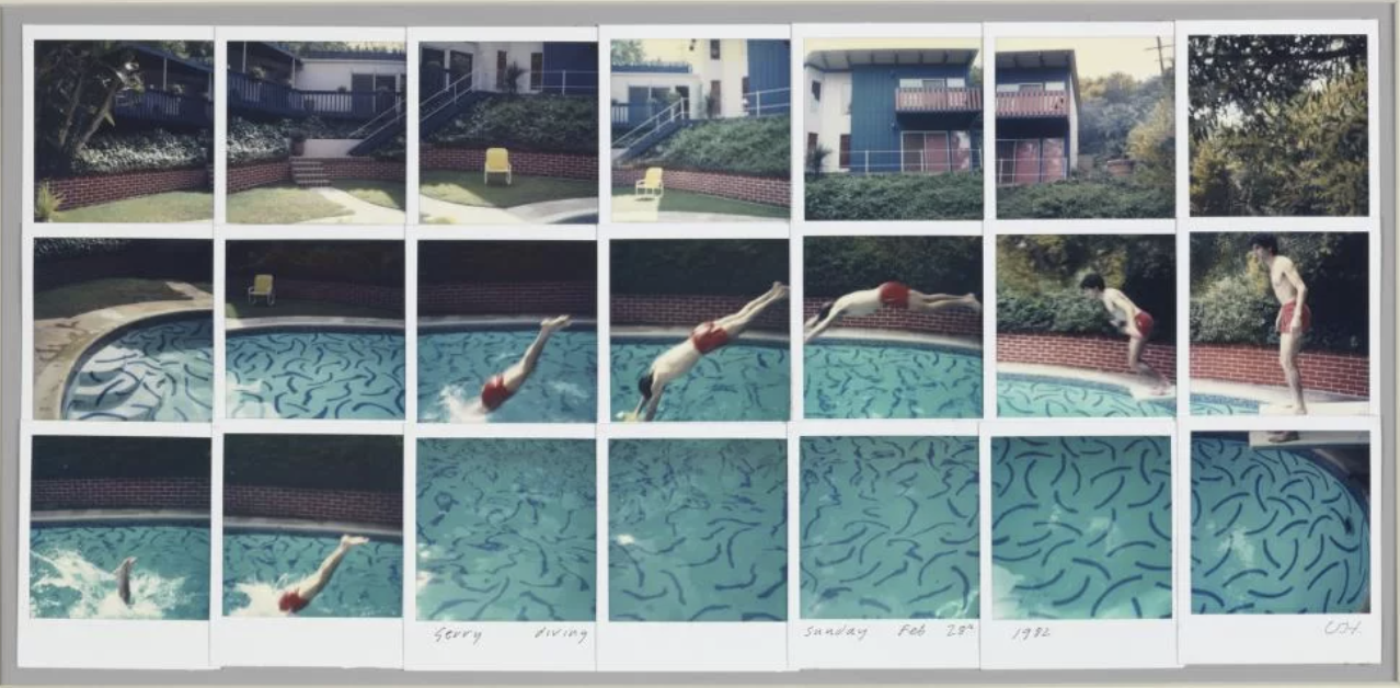
|
David Hockney uses 'Synthetic Cubism' to make his images seem distorted. Hockney often portrays his subjects as moving or tried to highlight his own movement in the photograph. His photographs invites our gaze to move from side to side, up and down.
What started as an exploration of the spaces of his house and the portrayal of his family and friends developed into a monumental work depicting vast American scenery. Yet instead of simply documenting the landscapes, Hockney depicted depth, trying to overcome the limits of eye-vision. He viewed his collages as a combination of painting and photography. He presented multiple perspectives in the same artwork to show how there is never a single true and privileged one that we should blindly follow. |
This work is heavily inspired by David Hockney with the experimentation of cubism taken on from him.
Hanna Lenz


These are self portraits taken by Julian Germain and Hanna Lenz. They both explore the atmosphere of elderly portraiture and understand the theme 'possessions' and what they mean to them. Lenz's work has a soft tone and simple quality to her work, the subject of the photo is obvious but the composition looks to be not though of intently too much. Else appears to be captured in a natural state without a planned position. Whereas Germain's work utilises vernacular photographs, collected from archives, catalogues and family albums lending his work an anthropological quality and indeed it can be seen to reflect on photography's place in society as well as record the passage of time.


