In this extended project my main focus will be on environmental portraiture. Here you will find photos that correlates to people and objects in their natural environment. This project will be mainly focussed on local areas. Here I will be exploring and playing around with different techniques, such as Rule of Thirds, symmetry and leading lines. My starting point will be focused on my local area and neighbour hood, where it's not too small nor too big. Starting with local shops and working my way up to much more bigger subjects. I am inspired by Nico Foehlich and possibly Henri-Cartier Benson. His work is based around people or objects in their natural state and environment, no posing or stopping.
Ideas :
Ideas :
- buildings - flats, estates
- surroundings
- cultural spaces (?)
- sky scrappers/ sight seeing attractions
- somewhere comforting
- somehere chaotic
- events/ social gatherings
- family and friends
- local markets


These 9 images is the start of what are in my surroundings and how i take advantage of them. The last series of photos illuminates of what is around me and sets the tone of what type of photography I am aiming for, environmental photography.
|
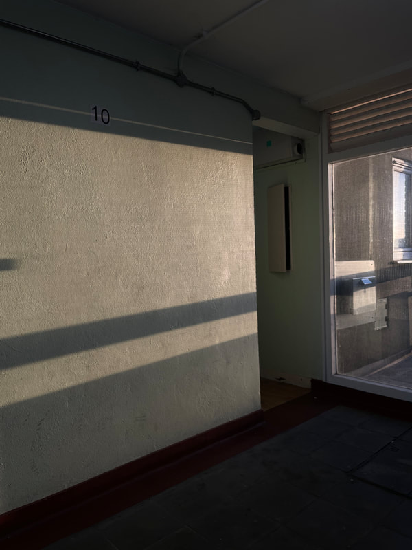
This image comes from the area that I live in. The light shines through and makes clear shadows that creates the effect of leading lines. The lines draws your attention to possibly, the centre, where the electrical box is. I was able to catch this moment when the sun was just starting to rise, which is why the colour isn’t t as vibrant but it's more warm which ,again, brings out the shadows.
This image is consists of straight lines that have been rearranged into vertical and horizontal lines. Different sized rectangles and squares are seen as well. |


|
However this image, didn’t come out how i wanted it to. Though it uses the elements of leading lines.
EBI: Next time i will position the camera in the centre so then the form of the image could be symmetrical . By doing this, it enhances the picture to make it seem clean proportional and balanced, which can change the whole perspective. WWW: Here, I think that the colours complements each other. The two colours creates a half-half effect to the image, which brings it to life. The different textures as well makes the image more lively. |

|


The concept of this small series is about the outcome after a rainy day. I captured this with my phone, leaning it against my window that has raindrops on it. This created a blurry and semi distorted effect. The start of the series, is a picture before is staring too poor down with rain. In both, the first and last image have a half-half effect with the two colours on either side. The second image is, in my opinion, somewhat comforting. All photos mimics the aesthetic of Foelich's work. The soft and warm lights collides that with the harsh red colour on the microwave, making the image pleasant to look at.

|
This is the edited version of one of the images from the previous collage. This image refers back to Henri Cartier. This is a combo between Nico's and Cartier's work, with the blurry effect and the black and white filter. What both artists have in common is using some sort of liquid (rain) to add some emotion in their work. For example, looking at this image, it reflects the emotion of sadness and somewhat boredom. The distortion from the raindrops disrupts the main appearance of the image.
|
